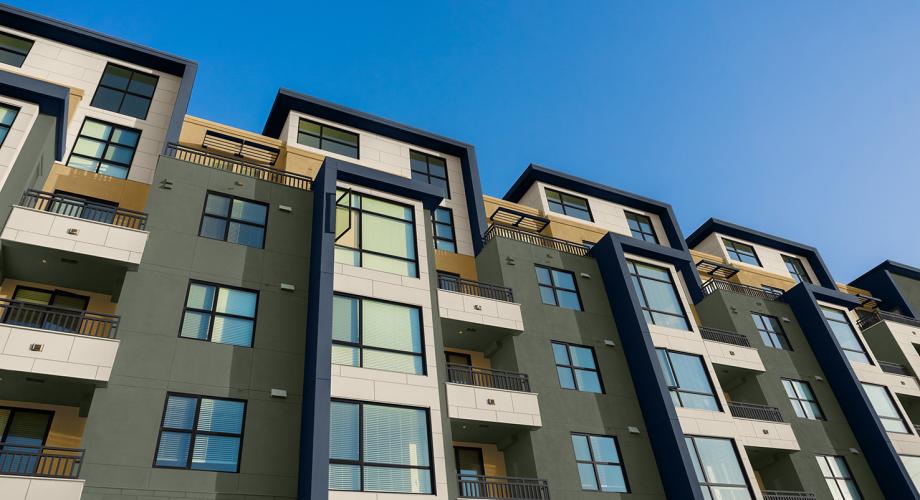
Sherwin-Williams is predicting trending hues for multi-family properties through its 2021 Colormix® Forecast Color Collections. The four palettes in the collection assist professionals in creating balanced environments. In this article, we explore how professionals can combine hues from the forecast's Encounter and Continuum palettes.
For many years, Sherwin-Williams has developed its annual Colormix Forecast for different segments of the real estate industry, from multi-family to new residential, commercial, healthcare, hospitality and education. This year’s 2021 selections for the multi-family market consist of four palettes: Encounter, Continuum, Tapestry and Sanctuary, which are based on the company's 2021 Colormix® Forecast
The colors in each palette help property managers choose which hues to pair together for different demographics, locations and types of rooms and make it easier for managers to make faster and more confident color selections.
Even before they paint, facility managers can visually test possibilities online by downloading the company’s ColorSnap® Visualizer paint color app and see rooms come to life with selected hues through augmented reality technology.
Having a wide variety of paint colors to choose from is not meant to suggest managers make sweeping changes yearly. Rather, they might consider a refresh when a new resident moves in and doesn’t want an all-white space, when a lobby is due for a renovation or when a new color trend creates a buzz.
“Most colors represent a shift,” says Katie Martin, an interior designer and color marketing expert at Sherwin-Williams. “Naval SW 6244, a deep navy, which was Sherwin-Williams 2020 Color of the Year, remains one of the most requested colors for multi-family feature walls. Naval is part of this year’s collection in the Encounter palette.”
Other blue hues are also included in the palettes, including Swimming SW 6764, part of the Continuum palette or Blustery Sky SW 9140, part of the Encounter palette, which shows a more rooted, deeper blue.
At the same time blue gains appeal, grays aren’t disappearing. Instead, grays have evolved into warmer hues with more taupe undertones. “Neutrals have a long lifespan and continue to evolve,” Martin says.
Before making a choice, professionals can count on Sherwin-Williams 2021 Colormix® Forecast Multi-Family Color Collection to facilitate color decisions for their community and ensure a space is filled with colors that residents will love.
Encounter
Real estate has become much more localized, and a building’s setting can offer a starting point of inspiration for choosing materials, colors and textures. The Encounter palette focuses on rich earth tones that connect with residents. Deep grounding tones such as Java SW 6090 and Rosemary SW 6187 can be offset with calmer influences like Jubilee SW 6248 and Alabaster SW 7008. The colors work well for exteriors and interiors and can be tailored for residents seeking comfort from familiar tones but with a modern twist.
Continuum
The Continuum palette brings a hybrid between smart living and the natural world. This is represented through colors within the planet, from sky tones in Commodore SW 6524 and Cyberspace SW 7076 to deep tones like Great Falls SW 6495, or subtle tones such as Novel Lilac SW 6836. For contrast, the palette includes paler hues such as
Moonraker SW 6701 and Wishful Blue SW 6813. “This is the ideal palette for feature walls, highlighting bright colors that might appeal to young professionals who seek trendy designs, along with neutrals that endure,” Martin says.
Sidebar/Box: Tips from color expert Katie Martin
- Use a bright pop of color to lead people into a shared space such as a front lobby, communal kitchen or bicycle storage/repair room.
- Select a lively saturated color, but consider applying on just one accent wall to avoid overwhelming a space.
- Consider using a neutral hue to navigate a hallway so it feels welcoming at the entry to each apartment.
- Anchor a space with black, white and navy tones and by adding different shades of warmer neutrals.
