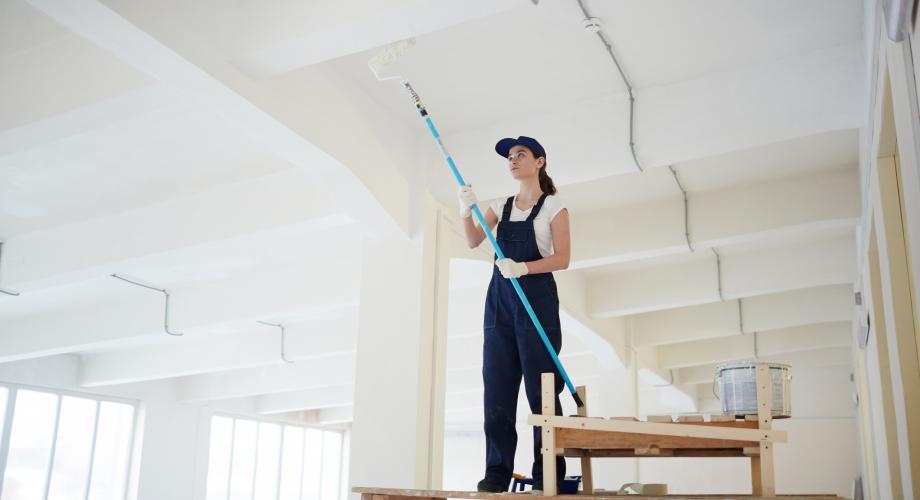
From neutral to bold, from classic to trendy, color is more than just a hue. Designers and marketers should take heed of this insight and advice from some of the industry’s leading color specialists.
When Choosing Colors, Keep Your ‘Poise’
Poised Taupe is the 2017 Color of the Year, according to Sherwin-Williams. A modern take on a timeless classic, Poised Taupe signals a new direction in society’s ever-growing thirst for beautiful neutrals that bring warm and cool tones together to create one irresistibly versatile color.
“Poised Taupe celebrates everything people love about cool gray as a neutral, and also brings in the warmth of brown, taking a color to a new level. Not cool or warm, nor gray or brown, Poised Taupe is a weathered, woodsy neutral bringing a sense of coziness and harmony that people are seeking,” says Sue Wadden, Director of Color Marketing for Sherwin-Williams.
Drawn from the Noir palette, one of four palettes in colormix™ 2017: The Sherwin-Williams Color Forecast, Poised Taupe addresses the search for authentic spaces that recharge the spirit in uncertain times and where perfection can seem like the ideal.
“Consumers yearn for spaces that feel welcoming and hug them as they enter. Earthen brown combined with conservative gray, creating Poised Taupe, embodies all of these emotions,” says Wadden.
With its cool-yet-warm vibe, Poised Taupe is an ideal backdrop for a wide range of color combinations, from pastels to brights to jewels. When paired with the faded indigo of Stardew(SW 9138), it creates a charming palette reminiscent of a French countryside. Used in tandem with vibrant Rave Red (SW 6608), it evokes the natural feel of red-stained bedrock. And with the deep teal of Marea Baja (SW 9185) and sunny hued Bee (SW 6683), it transforms into a supergraphic look.
This subtle shift to warmer colors reaches commercial spaces too, which tend to move in more conservative color cycles than residential or designer directions. Influences such as natural or organic materials, weathered and worn finishes and global cultural preferences suggest alternatives to the primarily gray existence that has been the star of commercial color direction during the past five years.
Trendspotting: Staying ‘Current’ With Color
Each year, the team of color experts at Behr immerse themselves in an extensive process to curate the latest hues by examining trends in art, product design, fashion and architecture. This forecast, paired with the modern ways in which people live, results in the development of the BEHR Color Currents, a collection of on-trend paint colors.
“Paint is more than just a color; it is a method of communication,” Erika Woelfel, Vice President of Color and Creative Services at Behr, says. “Color conveys emotion and allows people the freedom to express themselves and be who they really are. In today’s busy world, home is a haven, a retreat for living in the moment or welcoming guests for a weekend visit. That’s why our 2017 colors are time-honored and heart-warming, just like any homecoming should be.”
Behr takes a non-traditional approach to color forecasting. Instead of choosing one dominant color of the year, its team of experts create a collection of hues that are curated into themes, empowering individuals to choose colors and color combinations that speak to their moods, emotions and personalities. For 2017, the colors center around three overarching lifestyle themes: Comfortable, Composed and Confident.
Comfortable features soft, tranquil and versatile colors. Among them: Close Knit, Gold Hearted, Peek-a-Blue T17-04
Composed includes colors with depth and intensity. Among them: Polished Aqua T17-08
Confident is all about vivaciousness and impact. Its colors are saturated and bright, capturing attention and enlivening spaces. Among them:That’s My Lime T17-16.
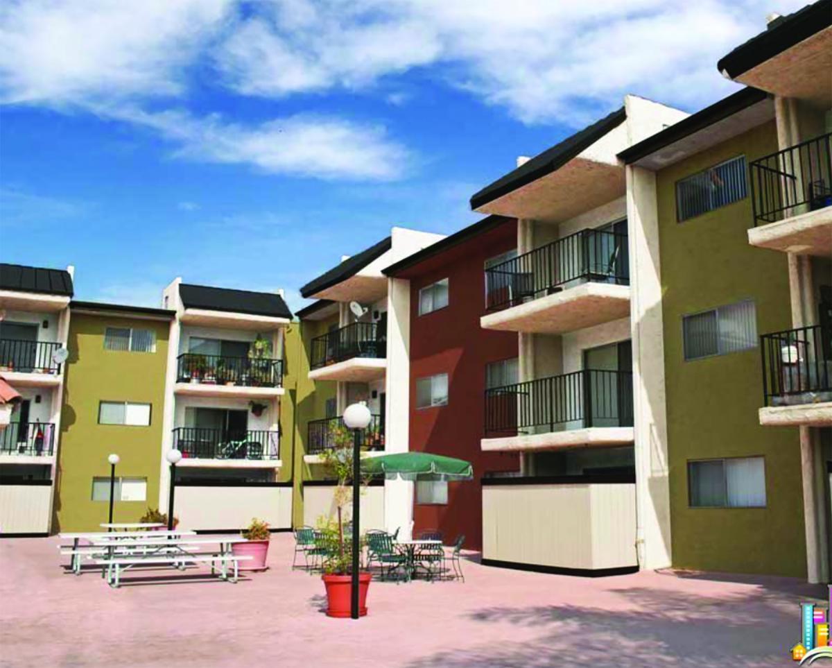
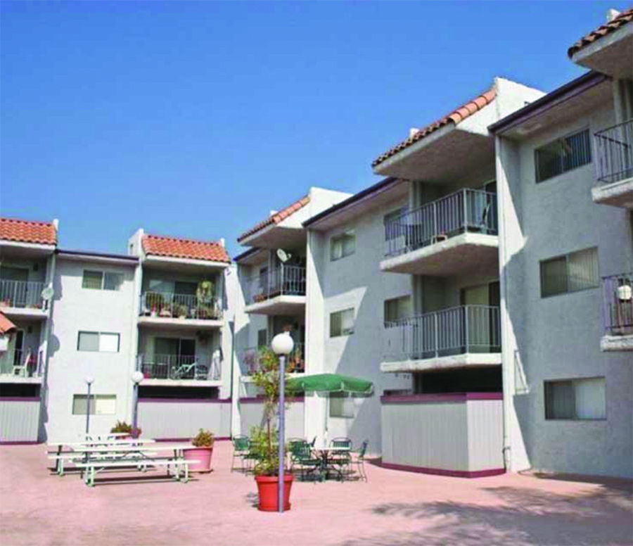
Color Palettes Help Curb Appeal Sparkle
Working proactively through their operating budgets could benefit apartment owners and managers to protect their assets rather. Repainting the community could help the asset stand out in a competitive market. A customized color palette could act as a marketing billboard that speaks to prospective residents and enhances curb appeal.When a community is first purchased, savvy owners first look to improve the impact of the frontage. Does this property draw people in or does it go unnoticed? Evaluate the condition of the monument and signage--is it dilapidated, hard to read or is it new and fresh? Also consider landscape—varieties of textures and colors. Try to determine how the building can set a mood, become an oasis or a favorite haven for people living in the area. -- Color Design Development Group
Reformulated Low-VOC Paint Improves Dry Time Performance
A new paint has been introduced to improve flow and leveling, providing an enamel-smooth finish with fewer brush marks. Its drying time has been reduced to 17 to 20 minutes to touch and two hours for recoat, resulting in less downtime and quicker job completion. With slightly more “open time,” or time that paint is wet enough for a brush to move through it, it gives pros a longer timeframe to fix brush marks or drips.
PPG Paints™ recently introduced this next generation of the <50 grams per liter volatile organic compound (VOC) version of Break-Through!® interior and exterior water-borne acrylic paint. It provides improved adhesion, hardness and block resistance to a variety of residential and commercial surfaces such as floors, trim, cabinets, railings, shelving, as well as pre-primed metal, wood, concrete, fiber glass, laminate and many plastics.