For some, designing a website that delivers even greater ease-of-use is not always so easy.
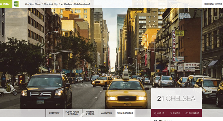
UDR, which launched its new site to rave reviews in November, drew most from applying focus group feedback, says its Senior Vice President and CIO, Scott Wesson. UDR built a site that he describes as agile and heavy on self-service, includes fresh photos and, of course, has all the information a prospective resident would want at their fingertips.
UDR conducted multiple focus group sessions (with approximately 80 total participants) and essentially asked: "What would you want to find on an apartment website that would best help you decide where you want to live?"
Sounds like a simple, logical way to learn what residents want, Wesson says, who adds that it was important to get inside the minds of renters when configuring the udr.com redesign.
"We didn't want to rely too much on our own associates making decisions about how udr.com should look or what should be emphasized," Wesson says, "because they are not the renters. Sometimes, when you only look to management or staff, you get too cute in the design. You think too hard. You might end up trying to do too much, or not enough. We wanted to focus on being functional for our customers, and not be overly creative."
Wesson says unlike some major website redesigns, UDR didn't go with a big-bang approach. "We didn't want to make a really big deal with the site, launch it, and then stop working on it for four years," he says. "In our planning timeline, we built in more gradual improvements, and budgeted to have them done over time."
'What Drives You Crazy?'
It all started with the focus groups, whose participants were asked: How do you search for an apartment? What do you want to find on our website? How would you like to find an apartment to call home?
Wesson also had the focus groups explore UDR's previous site, asking, "What did we get wrong on our website? What drives you crazy when you click through an apartment site?
The new site took approximately 18 months to create, from start to finish, which includes the time from the initial planning to conducting the focus groups and analyzing the feedback. Wesson says the actual building and testing of the site took just eight months, and that was much less time than UDR spent the last time it undertook a redesign.
The new site is driving prospective residents to UDR's 181 communities nationwide.
"We wanted the site to be user-friendly enough so that interested customers didn't have to communicate with us via email or a phone call, unless they wanted to," Wesson says.
"We wanted our prospective residents to arrive at the property with all the information they needed to make the right choice about which apartment they wanted to lease, or be able to lease without having to visit the property by leasing online."
He says he feels it is vital that apartment companies also provide relevant content. "The community's neighborhood descriptions must be interesting and compelling," he says. "
You need to keep the content fresh, including the images. We found that although we had some really great pictures on our site in terms of photo quality, some of them showed outdated furnishings. Not good."
Wesson says another key is to highlight calls to action for the consumer.
"If someone is on udr.com and wants to buy-in this case, rent-you have to make it easy for them to do that," he says.
Users want to gain trust by receiving accurate information, Wesson says, including rent prices.
"We want to be able to show real-time pricing and availability without the need to link back to our property management software sites, but at this time, that's not easy to accomplish," Wesson says.
"To provide the most up-to-date pricing information, it becomes a hand-off from your site to the property management software companies. Although we will have more real-time vs. day-old data available mid-2015 on udr.com, as an industry, I think we can get better on this."
Special Attention to SEO
Wesson says the new UDR site also focused on improving search-engine optimization (SEO).
"We realized that we weren't getting all of the optimization and results we were capable of," he says. "Our SEO has gotten better. But you won't be able to tell just by coming to our site. It's all 'under the covers.'"
Those improved results are triggered by the types of renters who visit the sites.
"The focus groups helped us to define renter personas, and we then tried to appeal to those personas through search terms and results," he says.
"For example, some visitors were area transplants who lived in other markets, so we wanted to build search terms for them, such as 'apartments in Orange County.' For others, they were local. So we wanted them to search for the name of a given, known neighborhood.
"Today's websites are more customer-facing than ever before. We are trying to facilitate the renting decision, and we believe that's a good thing," he says.
"At UDR, we want to convert lookers to leasers. That's our mantra."
Paul R. Bergeron III is Director of Publications at NAA.
